DATE

16/09/2022

Zara

Zara

Zara

Zara

Optimizing Zara's Website for Enhanced Usability and Faster Purchase Time

Optimizing Zara's Website for Enhanced Usability and Faster Purchase Time

Platform

Website

Role

UX Designer

Duration

3 Weeks

Challenges

Challenges

Challenges

Customers struggle to browse and purchase products efficiently on Zara's website due to poor navigation, cluttered design, and a confusing layout with unnecessary steps to complete a task compared to competitors like H&M.

Customers struggle to browse and purchase products efficiently on Zara's website due to poor navigation, cluttered design, and a confusing layout with unnecessary steps to complete a task compared to competitors like H&M.

Poor menu organization, low contrast, and hard-to-read fonts, making it difficult to locate products.

Poor menu organization, low contrast, and hard-to-read fonts, making it difficult to locate products.

Poor menu organization, low contrast, and hard-to-read fonts, making it difficult to locate products.

The site felt cluttered and unstructured, with inconsistent elements and poor readability.

The site felt cluttered and unstructured, with inconsistent elements and poor readability.

The site felt cluttered and unstructured, with inconsistent elements and poor readability.

The checkout process was slow and required too many steps.

The checkout process was slow and required too many steps.

The checkout process was slow and required too many steps.

Unclear pricing, and CTA made it hard to compare and add products to the cart

Unclear pricing, and CTA made it hard to compare and add products to the cart

Unclear pricing, and CTA made it hard to compare and add products to the cart

Impact

Impact

Impact

Ultimately impacting the overall user experience, Increasing purchase time, and decreasing satisfaction. This complexity affects user perception and loyalty, potentially hindering sales.

Ultimately impacting the overall user experience, Increasing purchase time, and decreasing satisfaction. This complexity affects user perception and loyalty, potentially hindering sales.

Expected Results

Expected Results

Expected Results

15-25%

15-25%

15-25%

Improved Overall User Experience

Improved Overall User Experience

Improved Overall User Experience

8-15%

8-15%

8-15%

Reduced Purchase Time

Reduced Purchase Time

Reduced Purchase Time

By redesigning Zara’s website with a user-centric approach, the shopping experience becomes seamless, efficient, and frustration-free, aligning with industry best practices to drive measurable improvements


  • Simplified Navigation – Clear categories and structure make browsing effortless.

  • Decluttered & Readable Design – Enhances usability and visual appeal.

  • Streamlined Checkout Process – Reduces unnecessary steps for faster purchasing.

  • Optimized Product Pages – Better visuals and organization for improved decision-making.


    These improvements directly address usability challenges, creating a more intuitive and enjoyable shopping journey ultimately increasing engagement, satisfaction, and conversions.
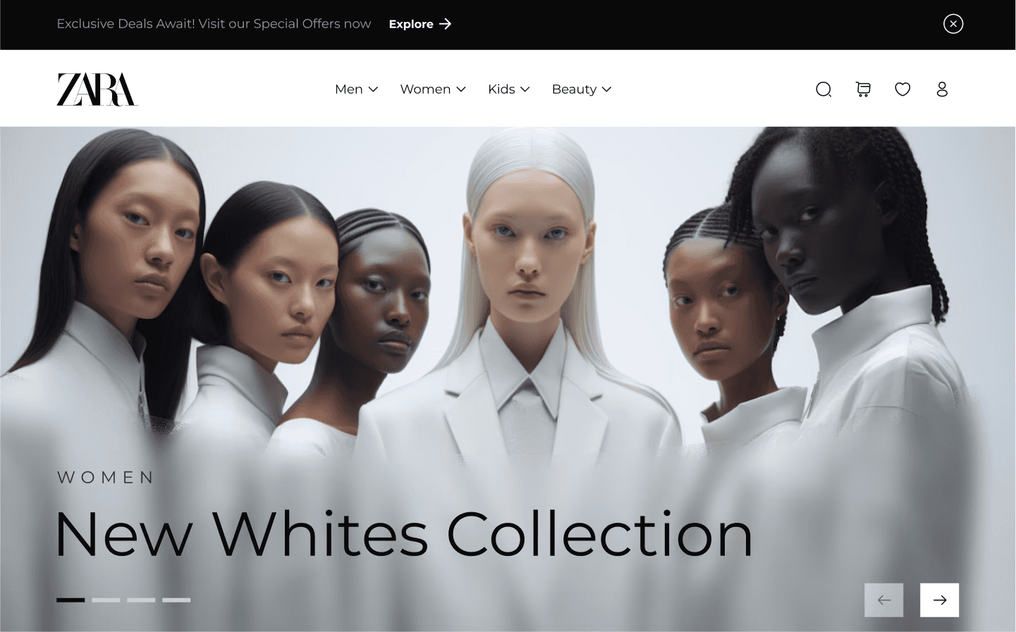
Improved Design

Improved Design

Improved Design

Ultra Watch

Landing Page

Landing Page

Landing Page

01

01

01

Enhanced Navigation: Replaced the hamburger menu with a more accessible navigation bar featuring clear labels and larger clickable areas

02

02

02

Faster Recognition: Added icons to navigation items for quicker identification

03

03

03

Improved Readability : Increased font size and weight for better legibility

04

04

04

Better Accessibility : Applied high-contrast colors to improve text and button visibility

Menu

Menu

Menu

01

01

01

Restructured Navigation : Organized categories into a clear and logical hierarchy for easier browsing.

02

02

02

Enhanced Visual Feedback : Added hover effects on buttons and links to improve discoverability and guide user actions.
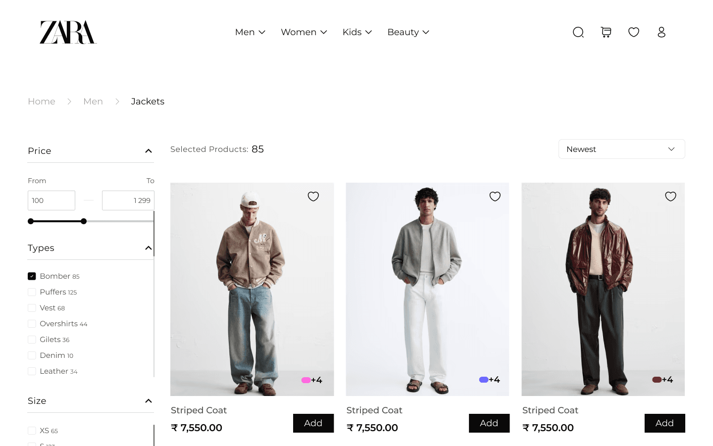
Product Listing

Product Listing

Product Listing

01

01

01

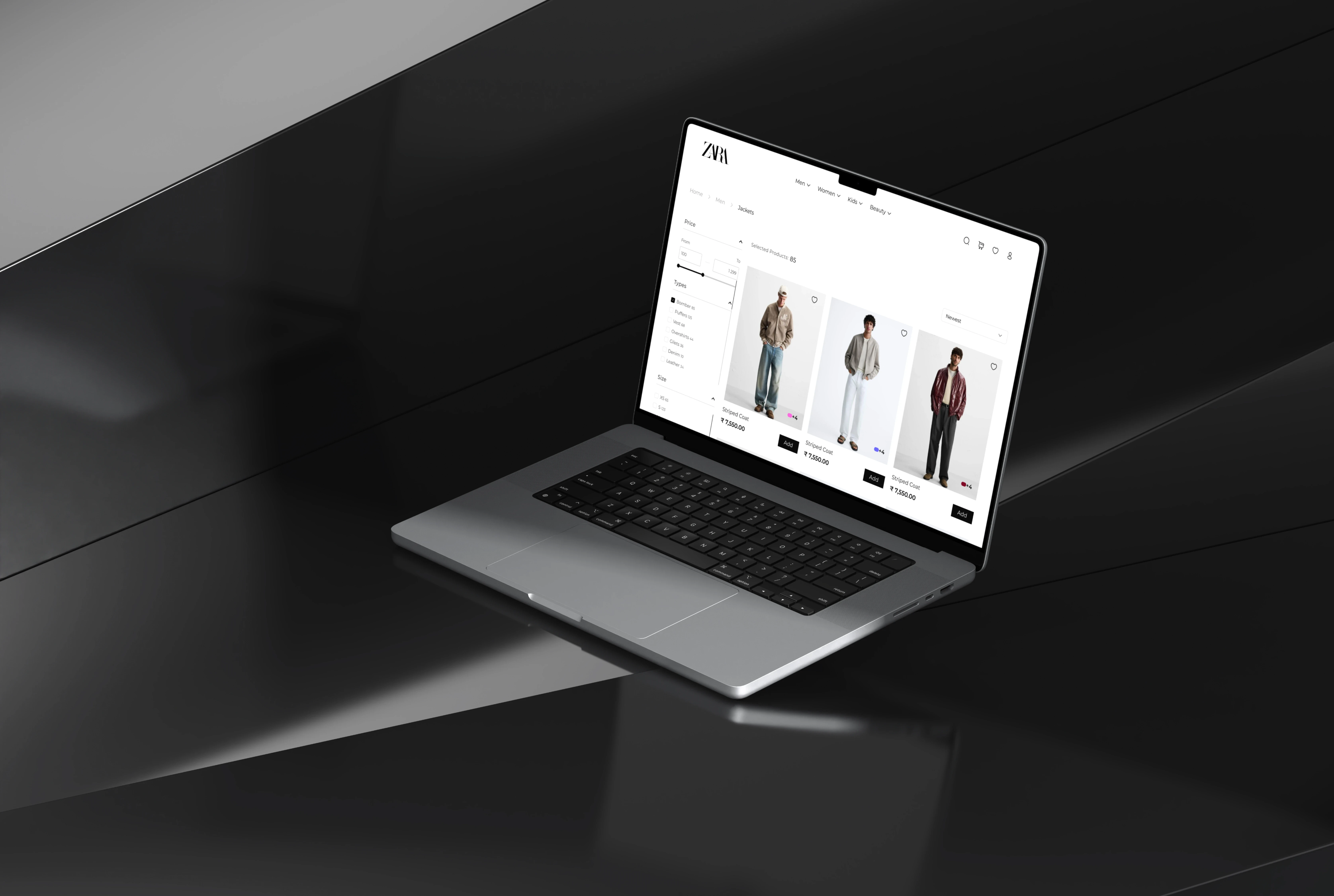
Added Breadcrumb Navigation : Helps users track their location, reducing back-and-forth navigation.

02

02

02

Organized Filters : Introduced filters for price, type, size, and color to simplify product discovery

03

03

03

Enhanced Call-to-Action : Used a contrasting color to make the CTA button stand out, encouraging quicker interactions

04

04

04

Clear Pricing Display : Ensured pricing is prominently visible with clean, easy-to-read formatting
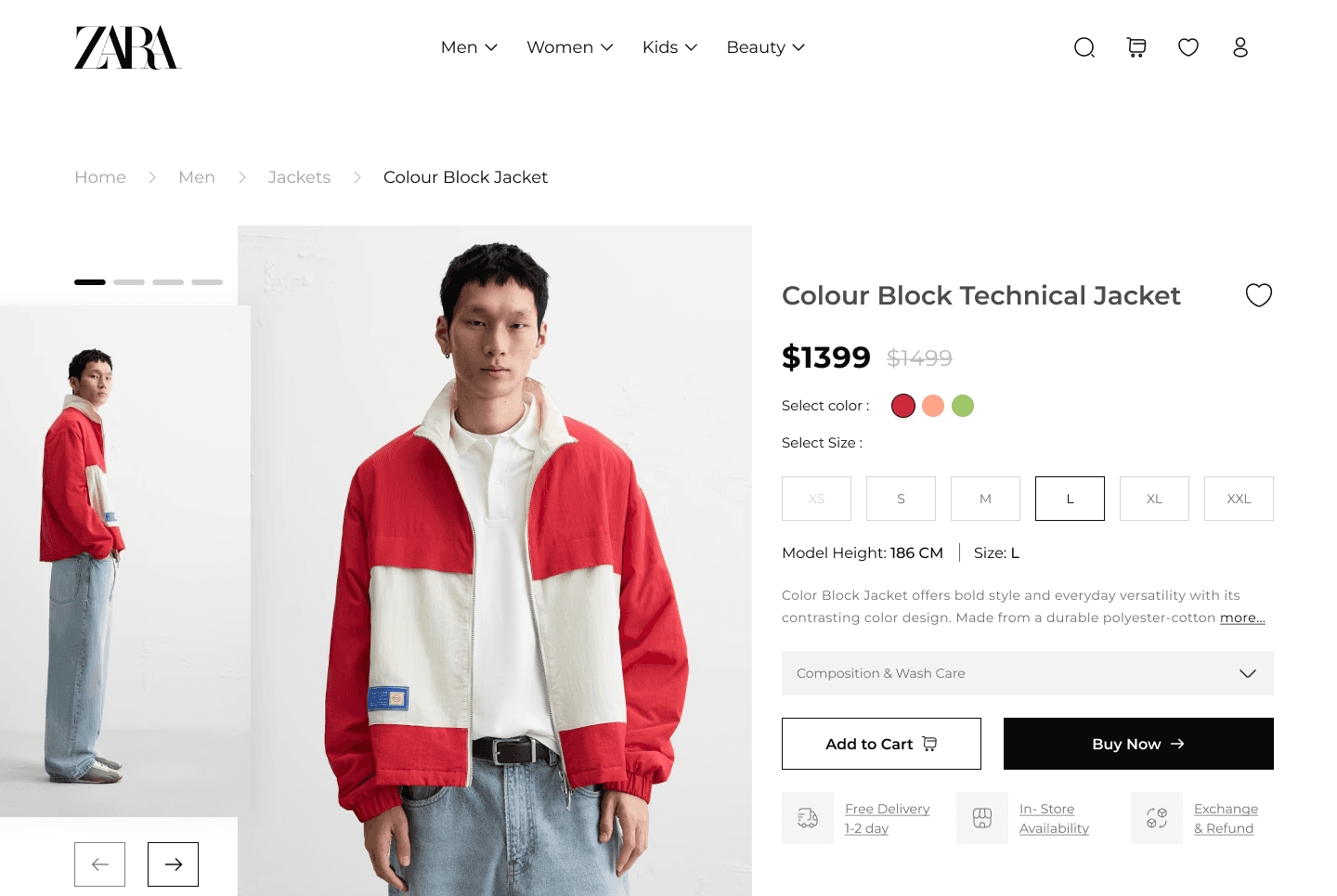
Product Detail

Product Detail

Product Detail

01

01

01

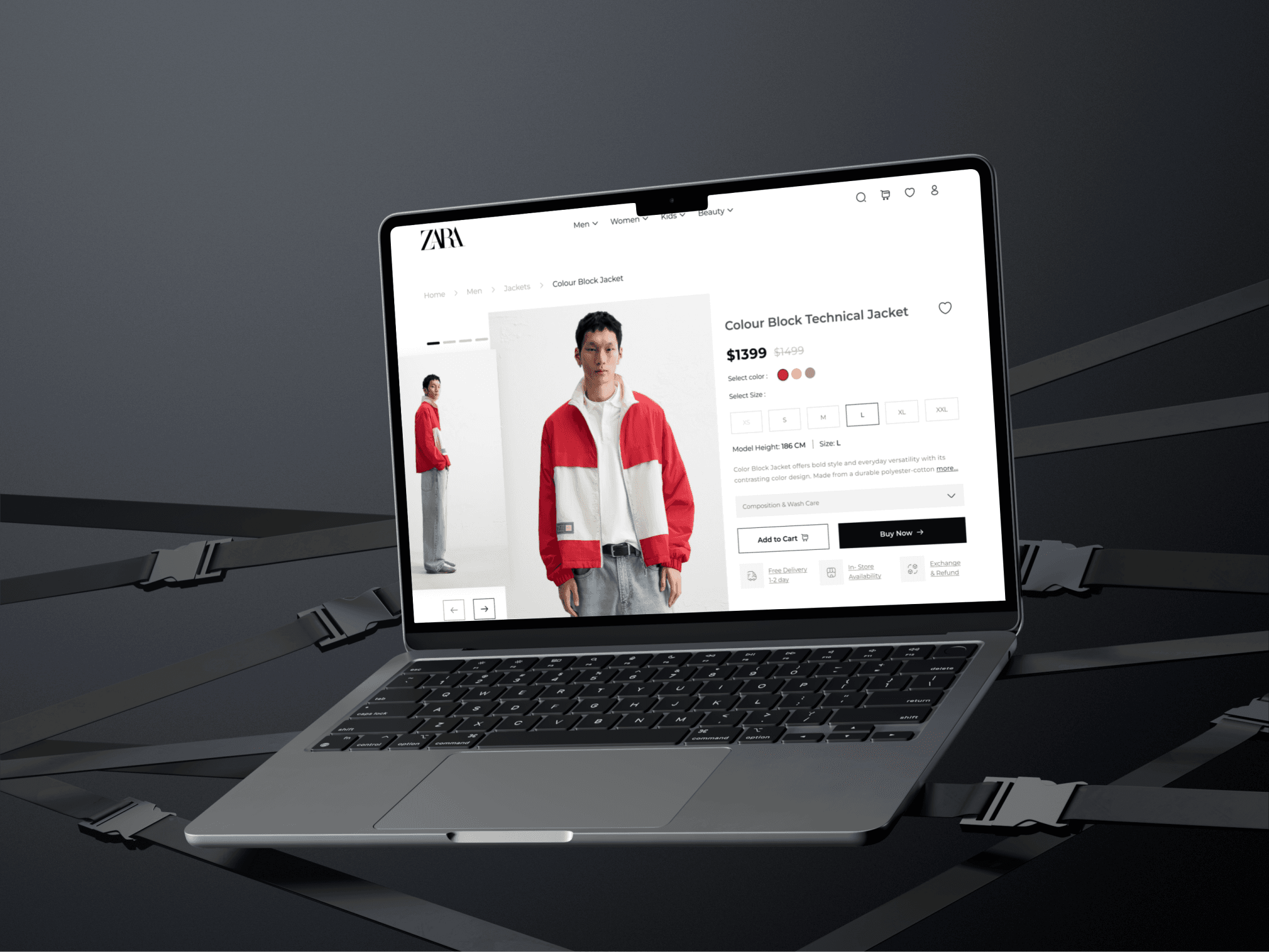
Faster Checkout Options : Added "Add to Cart" and "Buy Now" buttons, allowing users to proceed directly to checkout and reduce purchase time

02

02

02

Essential Information at a Glance : Clearly displayed model size, shipping details, and return policy to simplify decision-making and boost user confidence
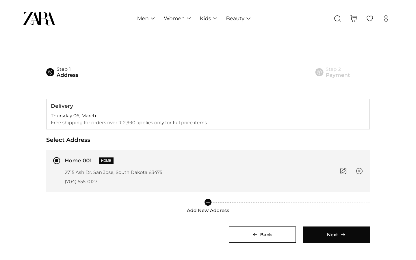
Address Section

Address Section

Address Section

01

01

01

Step-by-Step Progress Indicator : Provides a clear overview of the checkout process, reducing uncertainty and helping users complete purchases faster

02

02

02

Quick Address Management : Added visible edit and delete options, allowing users to make quick adjustments without frustration.
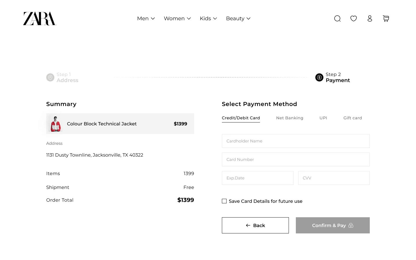
Payment

Payment

Payment

01

01

01

Detailed Order Summary : Displayed product details and pricing on the left side, ensuring users have full visibility before making a payment, reducing unnecessary navigation and providing clarity to streamline the payment process.

02

02

02

All Payment Options in One Screen : Allowed users to select card, UPI, or bank payment from a single view, eliminating extra steps and making checkout faster and more user-friendly.
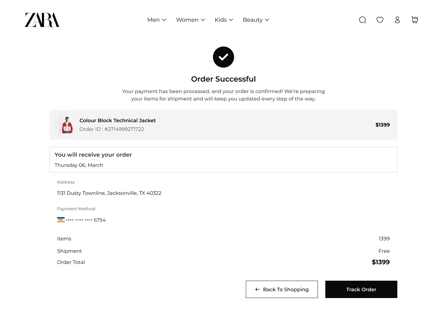
Payment Successful Feedback

Payment Successful Feedback

Payment Successful Feedback

01

01

01

Enhanced Post-Purchase Actions : Added “Back to Shopping” and “Track Order” buttons, giving users clear options to continue browsing or monitor their order, enhancing engagement and overall experience.
How I Got Here

How I Got Here

How I Got Here

Step 01 : Understanding the User needs and pain points

Step 01 : Understanding the User needs and pain points

Step 01 : Understanding the User needs and pain points

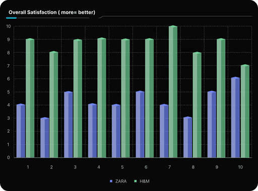
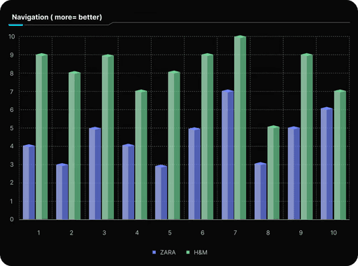
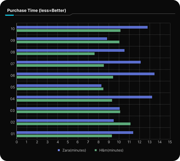
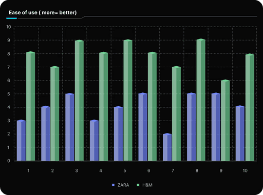
  • Conducted usability tests with 10 participants and observed their interactions with Zara's & H&M Websites.

  • To identify specific pain points users face while navigating, browsing products, and completing purchases.

  • I gathered insights by measuring time on task completion, rating ease of use, and collecting qualitative feedback on navigation, checkout, and overall satisfaction on both the brands website.

  • Conducted usability tests with 10 participants and observed their interactions with Zara's & H&M Websites.

  • To identify specific pain points users face while navigating, browsing products, and completing purchases.

  • I gathered insights by measuring time on task completion, rating ease of use, and collecting qualitative feedback on navigation, checkout, and overall satisfaction on both the brands website.

Research Insights

Research Insights

Research Insights

In a nutshell, the user feedback suggests that Zara's website suffers from poor navigation, cluttered design, slow loading times, and confusing layout, making it difficult for users to find and compare products. On the other hand, H&M's website is praised for its easy navigation, clean design, fast loading times, and intuitive layout, providing a more user-friendly experience with efficient product filters, well-organized options, and a smooth checkout process..

In a nutshell, the user feedback suggests that Zara's website suffers from poor navigation, cluttered design, slow loading times, and confusing layout, making it difficult for users to find and compare products. On the other hand, H&M's website is praised for its easy navigation, clean design, fast loading times, and intuitive layout, providing a more user-friendly experience with efficient product filters, well-organized options, and a smooth checkout process..

Step 02 : Generating Ideas and Solutions

Step 02 : Generating Ideas and Solutions

Step 02 : Generating Ideas and Solutions

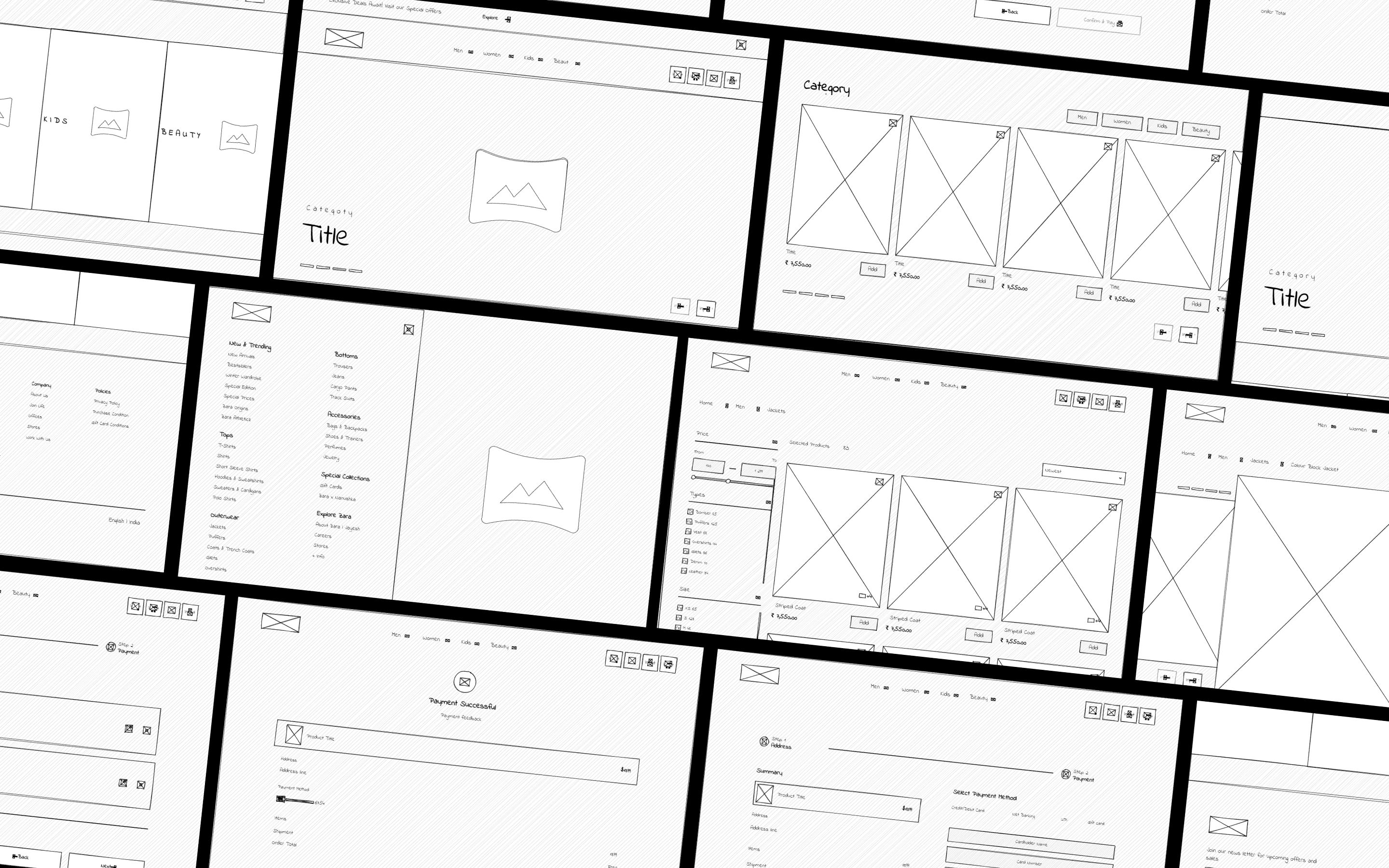
  • I brainstormed solutions to improve navigation, product browsing, and checkout flow.

  • Explored design inspirations from competitors and e-commerce platforms.

  • To generate multiple solutions and choose the most effective design that addresses user pain points.

  • Created wireframes and explored layout variations focused on navigation, product filtering, and CTA prominence

  • I brainstormed solutions to improve navigation, product browsing, and checkout flow.

  • Explored design inspirations from competitors and e-commerce platforms.

  • To generate multiple solutions and choose the most effective design that addresses user pain points.

  • Created wireframes and explored layout variations focused on navigation, product filtering, and CTA prominence

Step 03 : Translating to Hi-Fi Design

Step 03 : Translating to Hi-Fi Design

Step 03 : Translating to Hi-Fi Design

  • I Took the wireframes from Step 2 and translated them into high-fidelity designs that reflect the look and feel of the final product

  • To create a more realistic, polished design that addresses user pain points

  • Applied visual design principles, considering branding, typography, and UI patterns, while maintaining a focus on usability and accessibility.

  • I Took the wireframes from Step 2 and translated them into high-fidelity designs that reflect the look and feel of the final product

  • To create a more realistic, polished design that addresses user pain points

  • Applied visual design principles, considering branding, typography, and UI patterns, while maintaining a focus on usability and accessibility.

Conclusion & Future Plans:

Conclusion & Future Plans:

Conclusion & Future Plans:

The redesign of Zara’s website addressed key usability issues such as poor navigation and cluttered design. Through research and wireframing, the user experience was significantly improved with a clearer layout, better contrast, and more intuitive navigation

  • User Testing: Conduct usability testing to validate the redesign and gather user feedback.

  • Iterative Process: Continuously improve the design based on insights from user testing and feedback.

  • A/B Testing: Run A/B tests to compare different design elements and assess their effectiveness.

The redesign of Zara’s website addressed key usability issues such as poor navigation and cluttered design. Through research and wireframing, the user experience was significantly improved with a clearer layout, better contrast, and more intuitive navigation

  • User Testing: Conduct usability testing to validate the redesign and gather user feedback.

  • Iterative Process: Continuously improve the design based on insights from user testing and feedback.

  • A/B Testing: Run A/B tests to compare different design elements and assess their effectiveness.

Create a free website with Framer, the website builder loved by startups, designers and agencies.